


why is my site not rendering properly on an iphone WordPress
nice white background to #page width:1100px looks fine on the web: http://www.howtoheal.co.uk.server111.ukservers.net/
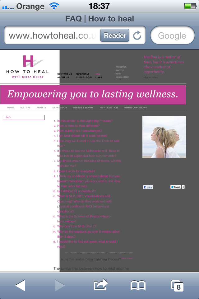
on an iphone, looks rubbish (see screenshot attached or check on http://iphonetester.com/).
Can anyone give me the css to fix it please!?
Answers (4)

Fahad Murtaza answers:
which page of the site it is?
Fahad Murtaza comments:
I see its FAQ.
Fahad Murtaza comments:
Its working perfectly for me.
http://www.webpagescreenshot.info/i/701108-130201293950pm.png

Mike Gertrudes answers:
Dave,
I think it's because your stylesheet (the Twenty Eleven one: http://www.howtoheal.co.uk.server111.ukservers.net/wp-content/themes/twentyeleven_2/style.css) is calling media queries.
If you look at that css file, you'll see lines of code like this:
@media (max-width: 450px) {

	#content .gallery-columns-2 .gallery-item {

		width: 45%;

		padding-right: 4%;

	}

	#content .gallery-columns-2 .gallery-item img {

		width: 100%;

		height: auto;

	}


}

@media only screen and (min-device-width: 320px) and (max-device-width: 480px) {

	body {

		padding: 0;

	}

	#page {

		margin-top: 0;

	}

	#branding {

		border-top: none;

	}


}
This is changing the styles depending on the width of the device screen. Twenty-Eleven is a theme that uses responsive design.
If this is a child theme, you will have to override these styles in that child themes style.css. Good luck!

Ross Wilson answers:
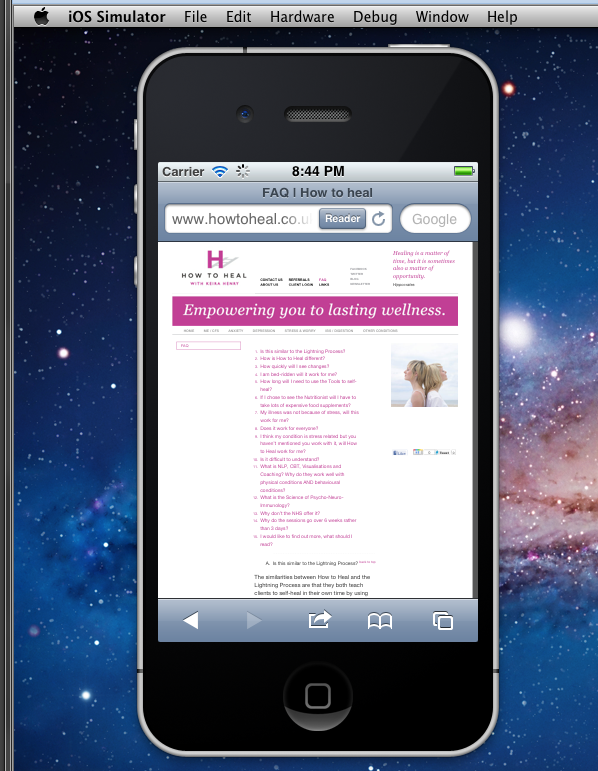
It does appear to be working properly in the iPhone hardware simulator, both for regular displays and Retina display devices.

Julio Potier answers:
Hello
FYI http://iphonetester.com is not a good testing site for this, it just resize your website into an iframe, instead of sending the right headers to fake smartphones ...