template fails on one blog, fine on other WordPress
- SOLVED
PLEASE DISREGARD. In looking over the files I once more, I discovered that all the files under "autofocus" in themes were in a separate "autofocus" file underneath that. Once I fixed that problem, the issue was gone.
Sheesh. You all loosened it for me, though!
Hello there:
I'm running two sites--or two sites in one, really--using the same template, [[LINK href="http://fthrwght.com/autofocus/"]]AutoFocus + Pro[[/LINK]]. a child theme of Thematic that is aimed at photographers and others exhibiting and/or selling digital images.
I first used the theme for a[[LINK href="http://cosmic-rays.com/charity "]] charity fundraising site[[/LINK]], and it worked beautifully, not just the regular portfolio/gallery-style thumbnails for photo post entries, but for the sliding gallery at the top, which works by making "sticky posts."
Now, around the time I was working on the charity site, I was growing frustrated with my regular photo blog template, Graph Press's Full Size. Consequently, I decided to switch to AutoFocus Pro for my regular [[LINK href="http://cosmic-rays.com"]]photo site[[/LINK]] as well. That took some tweaking, primarily in re to adapting to slightly smaller photo sizes, but it worked, and worked well, and looked better on mobile devices.
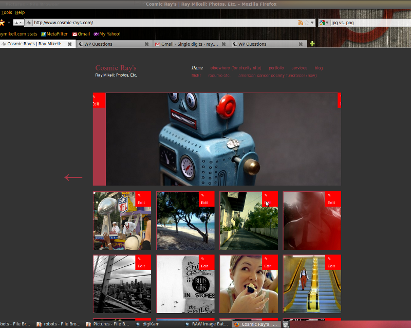
Unfortunately, I have been unable to use the sliding gallery via sticky posts in the same way. All photos end up slightly to the right, with a little space left at the left. This looks horrible. I have made absolutely sure that I have the same coding in both "appearances" section, the style templates and whatnot. There are no discrepancies. I'm wondering if there's a database error in there somewhere? Anyone have a clue?
My main photo site will be the most important for me in the long run, and want to make this work as soon as possible. Just to be on the safe side, the site's in questions are at:
<strong> http://www.cosmic-rays.com/
http://cosmic-rays.com/charity</strong>
I have attached a screenshot of the former site, which may give you some idea of what is going on. The red space on the left is the problematic one. If you see something on the right that's an "edit" button that has shifted to the right, along with the photo. Thank you for your time and assistance.
Ray

Answers (2)
Dan | gteh answers:
If you had to modify the theme slightly to adapt to smaller images, you'll need to modify the css of the slider to fit the new size of images as well.
Take a look at which classes are being used by the slider and modify the CSS to match the size of the photos.
Alternatively, you could apply a nice background image and center the main photo so the overflow on the sides will have a border defined around it.
Ray Mikell comments:
To clarify: I didn't modify the theme to fit smaller images, I had to make the existing images smaller to work with the new site. AutoFocus Pro works best with images of 800 width, whereas the old template worked best with images of 950 width. Consequently, I had a good deal of rescaling to do with my web photos. Hope that works.
Dan | gteh comments:
Hmm.. .When I view http://www.cosmic-rays.com/ right now I see the default kubrick theme and not your autofocus theme. Did you change it?
flashingcursor answers:
Not sure if this is the issue, but the working site is importing a number things from a reset.css file and the elements throughout the site inherit values from it.
@import "../thematic/library/styles/reset.css";
Perhaps adding the reset file on the new site would cure your woes...
Ray Mikell comments:
Thanks. Didn't work, but ... thanks.
flashingcursor comments:
Hrm ... first time I compared those sites one was loading a bunch of css (reset.css typography.css, etc...), the other wasn't ... Now they're both looking the same.
Was there a syntax error in your styles.css that was causing it to not load up properly?
Curious to know what solved the problem.


