how do I get rid of the bullets in IE? WordPress
- SOLVED
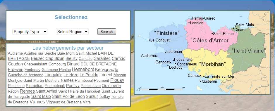
doing my head in a bit... got a series of widgets in a widgetised area at the top of this page:
http://www.locationvacancesbretagne.com/
layout is great in Firefox, and in Chrome, but in IE the boxes are not adopting the style for the ul I've applied (ie none).
Any helpers out there care to put me out of my misery?
.home #content .aside ul {

list-style-image:none;

list-style-type:none;

margin-left:0;

padding-left:0;

}
also tried:
ul.xoxo {

list-style-image:none;

list-style-type:none;

}
EDIT:
@meredith
site is using Thematic framework, css is here: http://www.locationvacancesbretagne.com/wp-content/themes/mydirectory/style.css
@Utkarsh Kukreti
on the map and tags widgets. both are showing bullets, and are out of alignment as a result.

Answers (2)
Meredith Marsh answers:
Try using the #index-top inside of the .aside ... so:
.home #content #index-top ul {
list-style-image:none;
list-style-type:none;
margin-left:0;
padding-left:0;
}
Also, your source in IE (7) is showing that you've got two <li>'s outside o<script type="text/javascript" src="http://www.wpquestions.com/js/tinymce/jscripts/tiny_mce/themes/advanced/langs/en.js"></script>f the <ul> completely... these are the ones displaying bullets where you don't want... yes? #text-4 and #new-tag-cloud?
Actually, i take that back. It shows up that way viewing with the IE developer toolbar, but not in the source, which is really odd.
Utkarsh Kukreti answers:
Where exactly do you seeing the bullets in IE? I cannot seem to find anything wrong.


