adapt plugin to custom theme WordPress
- SOLVED
http://wordpress.org/extend/plugins/simple-author-highlighter/ should run on the blog http://apfeltech.net but it needs a few changes because there are problems with the wp-comments tag of the theme.
optional: if it's possible to add instead of the color a badge.

Answers (3)
Dan | gteh answers:
the link to http://www.dakulov.eu/#page5 doesn't work. the domain appears to be down.
zobi comments:
http://wordpress.org/extend/plugins/simple-author-highlighter/
Dan | gteh comments:
What's the problem with the comments template?
I created a test account and checked to see if the correct class is being applied, and it is.
The plugin looks for the class .comment-author-wpquestions (the username follows -author-)
If you go to the settings for that plugin, and add wpquestions (my username) to the list of usernames and assign a background color to it, it should work just fine. If you want to send me a private message here with login details I'll take a look.
TO add a badge, you need to add this to the end of your theme's stylesheet:
.comment-author-wpquestions {}
And inside the {} you can style it such as:
.comment-author-wpquestions {background: url(badge.jpg) no-repeat;}
and then position it accordingly.
zobi comments:
thanks for the reply but have a look at the uploaded image (http://wpquestions.com/uploads/zobi_phpy2OzLP.png) the plugin chooses the wrong box. any idea why?
Dan | gteh comments:
Your theme is using a background image for the containers.
This is why:
In your theme's style.css is this:
.block-in {

height: 1%;

overflow: hidden;

background: #DDD url(images/bg-block-in-l.gif) repeat-y;

}
If you change to
.block-in {

height: 1%;

overflow: hidden;

/*background: #DDD url(images/bg-block-in-l.gif) repeat-y;*/

}
which removes the background image, then the highlighting works.
zobi comments:
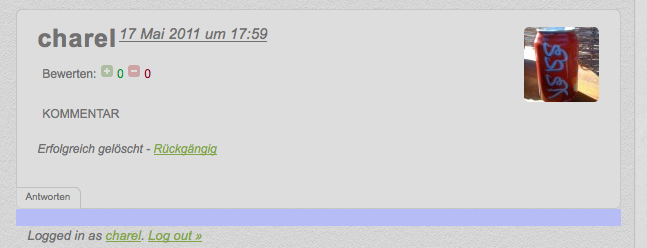
well... have a look at the .zip.
1) the comment section where you write the comment doesn't look good
2) badge wrong, should be right
3) the blue blox doesn't look good
4) under the blox is blue
http://apfeltech.net/2011/05/17/apple-tv-fur-nur-99e/
Dan | gteh comments:
I don't see the zip but I checked out the example page you sent and still see the background image in css.
If you look for
.block-in {

height: 1%;

overflow: hidden;

background: #DDD url(images/bg-block-in-l.gif) repeat-y;

}
Which is at line 196 of your main theme's style.css you need to remove/comment out
background: #DDD url(images/bg-block-in-l.gif) repeat-y;
After you comment out that piece of code, the highlighting will work.
There will still be a bit more customization to that class needed afterward, but the initial problem of the highlighting not working will be solved by commenting out the background image.
zobi comments:
background: #DDD url(images/bg-block-in-l.gif) repeat-y; was comment out but now removed.
Yes okay i've now the highlighting but it does not work as it should. have a look at the highlighted box... it doesn't look good, it's ugly x 10000 and the comment box is now ugly too because the comment box is missing at the box where you write the comment and where the comment is.
so this doesn't help if it's look like that..
.zip now uploaded.
zobi comments:
argh okay you can't upload a .zip... so have a look at http://apfeltech.net/2011/05/17/apple-tv-fur-nur-99e/ and the ugly comments without the box: http://apfeltech.net/2011/05/17/beejiveim-zurzeit-fur-499-e-erhaltlich/
Dan | gteh comments:
Sorry I am not a css/design person so I can't help with full styling to make it look pretty. The original question asked about a problem with the comment template itself which I pointed out to you on how to solve. Maybe someone else here can advise on how to style it so it looks pretty.
zobi comments:
mh okay but is it possible to have only a badge? (with the boxes?)
.comment-author-charel {background: url(http://apfeltech.net/wp-content/themes/apfeltech/images/Badge.png) no-repeat;}
is still in the style.css
Dan | gteh comments:
maybe something like
<code.
.comment-author-charel .block-in{background-position: left; background: url(http://apfeltech.net/wp-content/themes/apfeltech/images/Badge.png) no-repeat left -20px;
</code>
Dan | gteh comments:
Ooops I meant
.comment-author-charel .block-in{background-position: left; background: url(http://apfeltech.net/wp-content/themes/apfeltech/images/Badge.png) no-repeat left -20px;}
zobi comments:
jep works but now the box is gone. any idea to have box + badge?
Dan | gteh comments:
Replace it with this then:
.comment-author-charel .block-in{background-position: left; background: #DFDFDF url(http://apfeltech.net/wp-content/themes/apfeltech/images/Badge.png) no-repeat left -20px;}
I added #DFDFDF background color to it.
zobi comments:
nice :) so now we only need to put the badge at the right corner of the box. do you have any code for this?
Dan | gteh comments:
I dont think the ride side will work because of the avatars. This is being applied as a background image which means the avatar will appear on top of the badge. You can change the "left" in background: to "right" and you would need to open the image in photoshop and swap it around so it faces the other way.
in my opinion though it should remain on the left.
zobi comments:
i mean under the avatar, have a look at the screenshot.


