


Woocommerce styling WordPress
- SOLVED
I want the overall width of my website (http://79.170.40.234/newgcp.uk/) to be the same as http://www.thisiswhyimbroke.com/
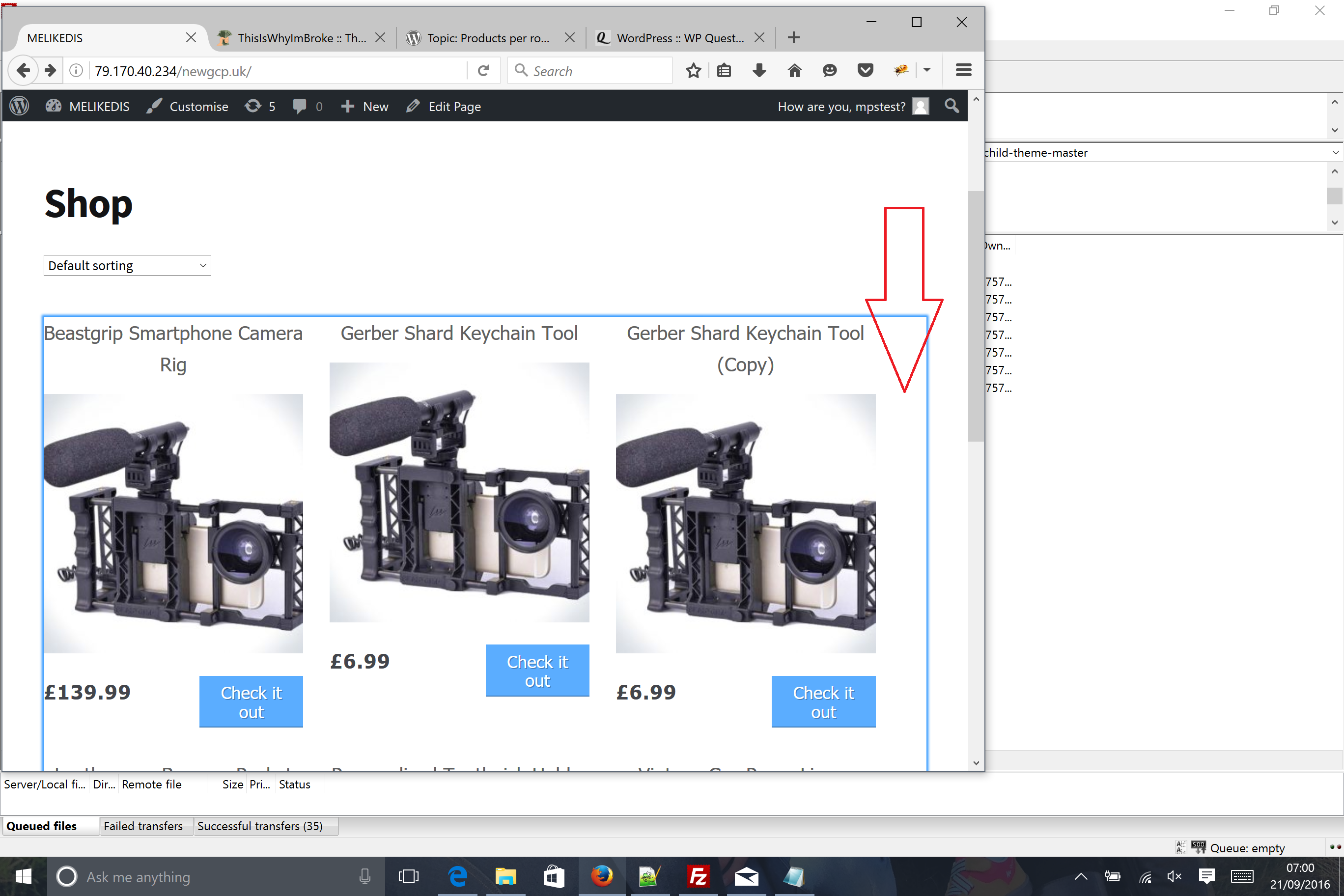
I also want the product rows with the margins the same as http://www.thisiswhyimbroke.com/ (see example attached)
The "was price" and the "price" I would like similar to http://www.thisiswhyimbroke.com/ where the price and saves are positioned.
finally, I want the "check it now button to never drop onto two lines when veiwing on any device.
Answers (2)

Rempty answers:
Add this css for the width of the page, margins products
.col-full{

    max-width: 970px;

}

ul.products {

    margin-left: -15px;

    margin-right: -15px;

}

.site-main ul.products li.product {

    margin-bottom: 3%;

    padding: 0 15px;

    margin-right: 0;

}

@media only screen and (min-width:992px){

    .site-main ul.products li.product {

        width: 33.33333%;

    }

}

@media only screen and (min-width:768px) and (max-width:991px){

.site-main ul.products li.product {

    float:left;

    width: 50%;

    clear:none!important;

    margin-right:0!important;

  }

  .site-main ul.products li.product:nth-child(2n+1){

    margin-right:0!important;

    }

}
suddy12007 comments:
Once again, your awesome!
Worked a treat. I've got loads more stuff that needs doing so keep a look out for more of my questions.
Would you mind letting me know how I can make the price (was/now) neater. I want it positioned in the same way
http://www.thisiswhyimbroke.com/ has the (price/saves)
the "was" price can stay above the "now" price I just want them positioning tightly to the bottom left, opposite the price.
Rempty comments:
Try this
ul.products li.product .price{

    text-align:left;

}

ul.products li.product .price ins{

    margin-left:0!important;

    margin-top:-5px;

    display:block!important;

}

Andrea P answers:
hi there!
here are the fixes for your container and columns
the problem was because the margins were changed but the columns width was still the woocommerce one.
ul.products li.product .button {

   min-width: 105px; /* raise this value if the button text still drops on 2 lines */

}

#page .col-full {

   max-width: 970px;

}

media only screen and (min-width:992px){

    .site-main ul.products li.product {

        width: 31.3333333%;

	margin-right:3%;

  }

}

@media only screen and (min-width:768px) and (max-width:991px){

  .site-main ul.products li.product {

    width: 48.5%;

  }

}
the first rule should prevent the button text to go on 2 lines. if it's still does it, you can raise that value till it doesn't anymore.
edit: I believe it's better to don't set px margins (as per Rempty answer) if the width is in percent. Also, the clearing and the other things are already present in the css. the only thing which need to be changed is the width of the column