


Sidebar goes down in Chrome below 1140px WordPress
- SOLVED
Hello friends!
Here is the page: http://yuriradaelli.it/cpe/shop/tende-doccia-tessuto/tenda-tessuto-cornice/
MY PURPOSE:
<strong>have the sidebar completely visible to the right ABOVE 1020px</strong> even in recent Chrome, Safari and IE in all most important devices like win7 and 8, Mac, Ipad, android tablets. (I don't care about any issues BELOW to 1020px width, nor IE 7, nor Android older than 4.4 or with rare browsers)
ISSUE:
<strong>Chrome and I.E.10/11 puts the sidebar down the content</strong> in a single row of 100% width when the display width goes BELOW 1140px
(FF 34,35,36,37 and I.E.7/8 shows sidebar like I want: to the right (FF 37 from 850px!) in netbooks and even in tablets)
ENVIRONMENT
I have made a mess with a wonderful theme: Dynamik Builder (Genesis framework) in single-product of woocommerce
http://dynamikdocs.cobaltapps.com/article/48-responsive-content-sidebar-media-query-styles
NOT USEFUL SOLUTION
If I change the second trigger changing the maximum width from 1140 to 1020, actually the sidebar remain to the right even in Chrome and IE, but in all browsers the entire page (even the header) "lost" responsiveness behavior and goes hiding over the right margin :-(
Here is the dynamik.css media classes, but could be possible that the problem depends to some crazy padding class I putted somewhere...
@media only screen and (max-width: 1140px) {
.site-container { border: 0; margin: 0 auto; -webkit-border-radius: 0; border-radius: 0; -webkit-box-shadow: none; box-shadow: none; }
#home-hook-wrap { padding: 0px 10px 0px 10px; }
#ez-home-container-wrap, #ez-home-sidebar-wrap { width: 100%; max-width: 100%; }
#ez-home-sidebar-wrap { margin: 20px 0 0; float: left; }
.site-footer .creds, .site-footer .gototop { width: 100%; text-align: center; float: none; }
}
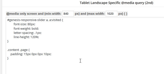
@media only screen and (min-width: 840px) and (max-width: 1140px) {
body.override .site-header .wrap { width: 100%; }
.title-area { width: 220px; }
.site-header .widget-area { width: auto; max-width: 799px; }
body.override .menu-primary, body.override .menu-secondary { width: 100%; }
.site-header .genesis-nav-menu { width: auto; max-width: 799px; }
body.override .site-inner { padding-bottom: 10px; }
body.override .content-sidebar-wrap { width: 100%; }
body.override .content { width: auto; max-width: 100%; max-width: -moz-available; padding: 0; }
body.content-sidebar-sidebar .content, body.sidebar-content-sidebar .content, body.content-sidebar .content { margin-right: 318px; }
body.sidebar-sidebar-content .content, body.sidebar-content .content { margin-left: 318px; }
body.full-width-content .content { margin: 0; }
body.override .sidebar-primary { width: 298px; }
body.content-sidebar-sidebar .sidebar-primary, body.sidebar-content-sidebar .sidebar-primary, body.content-sidebar .sidebar-primary { margin-left: -298px; }
body.sidebar-sidebar-content .sidebar-primary, body.sidebar-content .sidebar-primary { margin-right: -298px; }
body.override .sidebar-secondary { width: 100%; margin: 20px 0 0; float: left; }
Thanks to anyone wants to give me an explanation or a hand to understand what's the point!
I'd like understand the basics about how manage correctly the options on the Dynamik responsive panel, just to understand how avoid to hide content to the right and control a few the layout rows behaviors...
Or at least something more about controlling the rows by @media queries...
Answers (2)

Darlene Grace Arcenal answers:
Hi Enrico,
You must change all max-width: 1140px to max-width: 1020px and add .site-header{overflow:hidden} inside @media only screen and (max-width: 1020px) {}
SO this will now be:
@media only screen and (max-width: 1020px) {
.site-container { border: 0; margin: 0 auto; -webkit-border-radius: 0; border-radius: 0; -webkit-box-shadow: none; box-shadow: none; }
#home-hook-wrap { padding: 0px 10px 0px 10px; }
#ez-home-container-wrap, #ez-home-sidebar-wrap { width: 100%; max-width: 100%; }
#ez-home-sidebar-wrap { margin: 20px 0 0; float: left; }
.site-footer .creds, .site-footer .gototop { width: 100%; text-align: center; float: none; }
<strong>.site-header{overflow: hidden}</strong>
}

Enrico Maria Radaelli comments:
Hi Darlen Grace,
Thanks for your help.
I don't know if I made right your suggestion: the sidebar is visible in Chrome and IE, but goes hidden down the border, to the right. Only the header remain totally visible.
I suppose there is something class fixed that Firefox ignored but Chrome not.
Here there is the css of the theme, you can see now 1020 for the first trigger point and for the second:
http://yuriradaelli.it/cpe/wp-content/uploads/dynamik-gen/theme/dynamik.css
And here is the custom css changeable by panel:
http://yuriradaelli.it/cpe/wp-content/uploads/dynamik-gen/theme/dynamik-custom.css
I tried event putting .site-inner{overflow: hidden}
But nothing change.
If you go to the developer panel of Chrome, you can see there are other many 1044 max width, but this is the default size of the rows of the content, and header and inner... nothing to do with media queries I think...
http://dynamikdocs.cobaltapps.com/article/33-layout-widths
Now I have to go to the bed but tomorrow morning I look here if perhaps you have any other suggestions.
But for now, thanks for your help!