


Scaling Entire Site instead of Responsive - Genesis Theme/Dynamik WordPress
- SOLVED
How can I have my site: [[LINK href="http://timonjahnert.com"]]timonjahnert.com[[/LINK]] scale down automatically once someone starts resizing their browser?
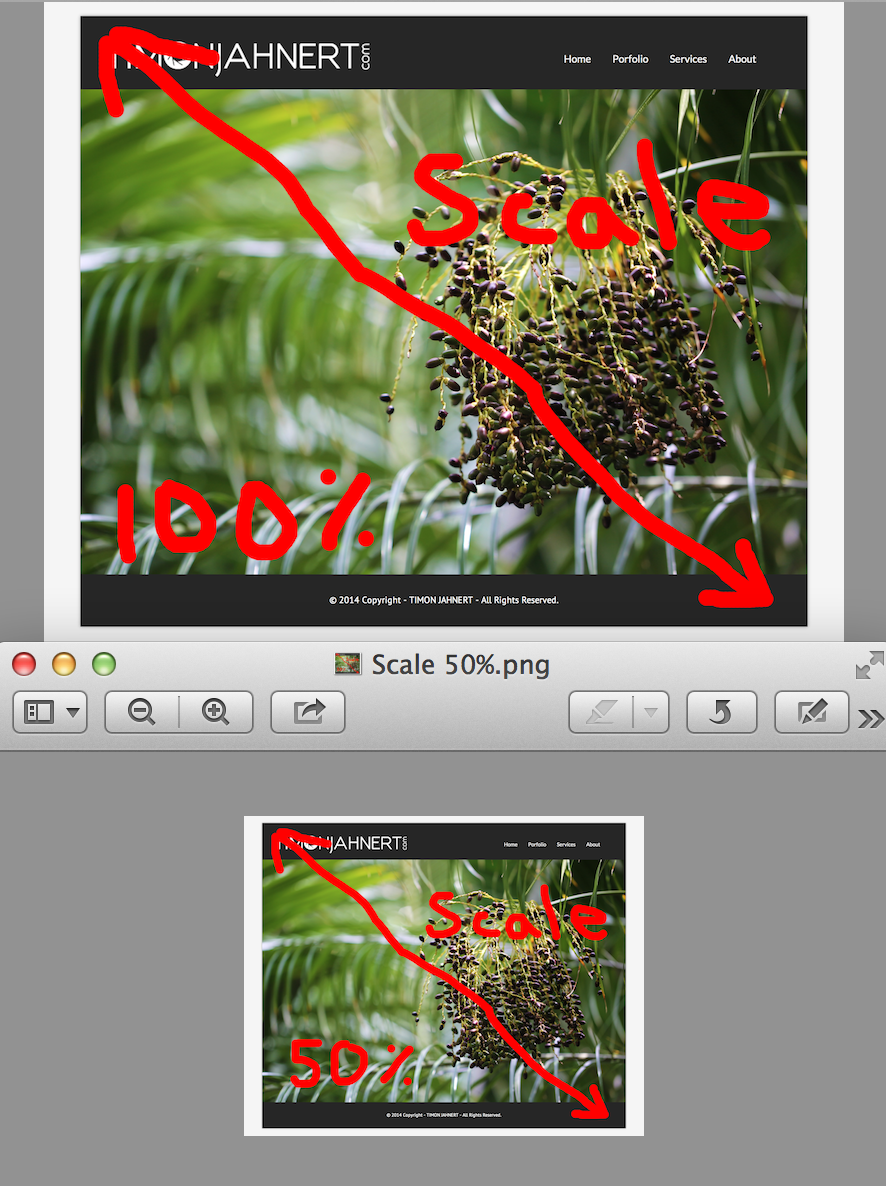
I like everything (fonts, logo, text, photos, etc) to be scaled down at the same time in order to keep everything looking good, rather than having just the fonts/logo/menu stay the same size like a responsive theme.
Currently my site looks different in every browser, Desktop, iPhone, iPad, etc. I just want it to be consistent, look the same, and the person can finger pinch zoom in on the site if it looks too small on their dinky phone.
I'm using the Genesis Theme with Dynamik.
Answers (2)

zebra webdesigns answers:
Hello Tim,
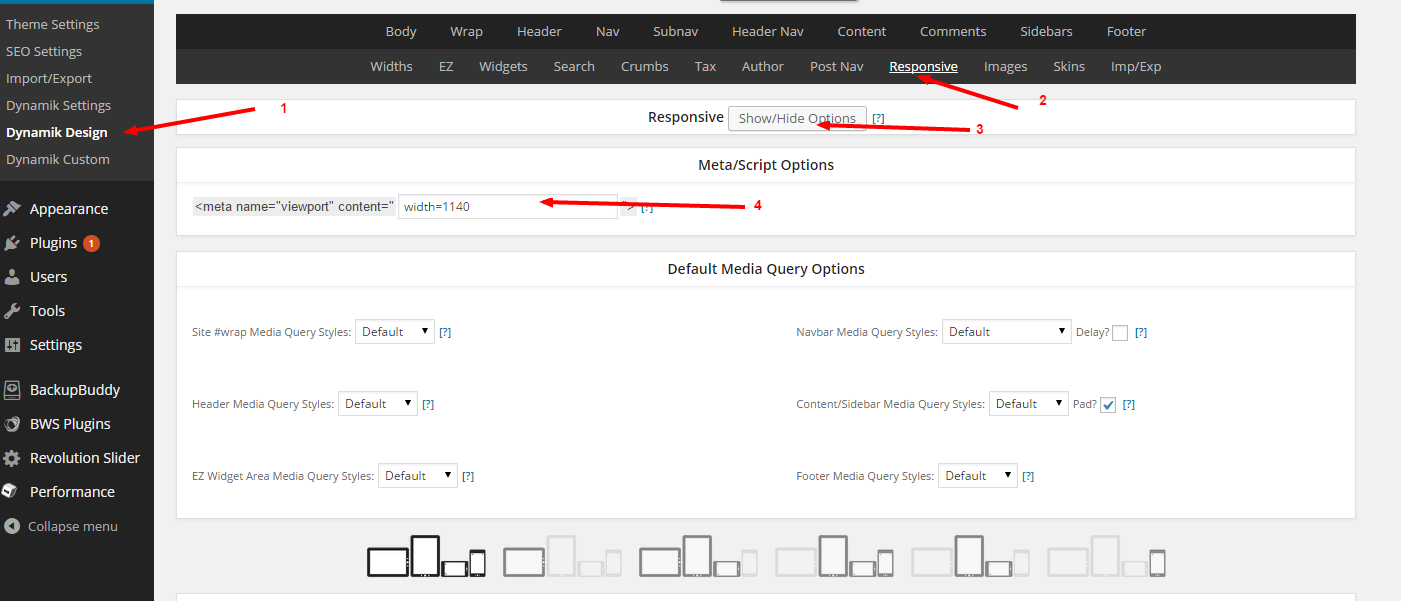
You can set the viewport device width in the dynamik design area.
check the screenshot attached.
here is a site done for a local client.
www.bloomshampoo.com
Dynamik +genesis --- non responsive
zebra webdesigns comments:
Also Tim,
I dont see a viewport in your website, possibly you could have removed it through remove_action.
in that case alternative way is put the code in to hook box
<meta name="viewport" content="width=1140"/>
Check the screenshot