


New header CSS not displaying well on iPhone or iPad WordPress
Hi,
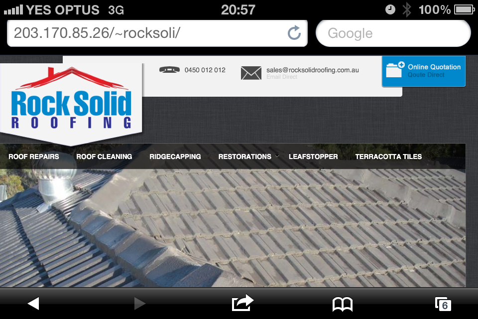
I have added all the right CSS extra codes that I have received here in the questions being answered. However on iPhone and iPad the layout is not working great at all. Please could you let me know what I need to edit for the top bar and logo to display well in ios. I have attached a screenshot of the layout issue.
Here is the CSS I have for that complete header area:
/* Drop Down Bar Button */


.style4 .megadropdown-bottom-bar #megadropdown-toggle-button {

width: 180PX;

height: 68px;

text-indent: -9999px;

}

.style4 .panel-close {

background: url(http://203.170.85.26/~rocksoli/wp-content/uploads/2012/07/dropdown-arrow.png);

}

.style4 .megadropdown-bottom-bar {

bottom: -71px;

}

.megadropdown-bottom-bar {

right: -12px!important;

}

.style4 .panel-open {

background: url(http://203.170.85.26/~rocksoli/wp-content/uploads/2012/07/dropdown-arrow-open1.png);

}


/* top bar */


#container-36 .one_half{

width: 44%;

margin-right:3%;

}

#container-36 {

width: 646px;

padding-left: 68px;

-o-border-bottom-right-radius: 5px;

-moz-border-bottom-right-radius: 5px;

-webkit-border-bottom-right-radius: 5px;

border-bottom-right-radius: 5px;

}


.phone a {

display: block;

padding-left: 55px;

background: url("http://203.170.85.26/~rocksoli/wp-content/uploads/2012/07/phone-sprite.png") no-repeat 0 0 transparent;

font-weight: normal;

font-size: 14px;

line-height: 14px;

width: 200px;

margin-left: 134px;

}

.phone span {

color:lightgray;

font-size: 12px;

}

.phone a:hover {

background: url("http://203.170.85.26/~rocksoli/wp-content/uploads/2012/07/phone-sprite.png") no-repeat 0 -30px transparent;

font-weight: normal;

font-size: 14px;

line-height: 14px;

width: 200px;

}

.email a {

display: block;

padding-left: 55px;

background: url("http://203.170.85.26/~rocksoli/wp-content/uploads/2012/07/mail-sprite.png") no-repeat 0 0 transparent;

font-weight: normal;

font-size: 14px;

line-height: 14px;

width: 200px;

}

.email span {

color:lightgray;

font-size: 12px;

}

.email a:hover {

background: url("http://203.170.85.26/~rocksoli/wp-content/uploads/2012/07/mail-sprite.png") no-repeat 0 -30px transparent;

font-weight: normal;

font-size: 14px;

line-height: 14px;

width: 200px;

}


/* logo */

#logo-container {

margin-top: -70px;

position: relative;

margin-bottom: -14px;

z-index: 10;

}
Answers (6)

Jatin Soni answers:
Try changing width value from pixel to % (percentage) that may works

Ciaran Whelan comments:
I tried that, but made it worse..

Arnav Joy answers:
is all other css is working in ipad and iphone..
Ciaran Whelan comments:
Yes, all other CSS works good. However, as you can see in the screenshot attached, the logo seems to drop down from the top by about 10px, the phone div height seems to be cut in half, and the "online Quotation" button seems to be resized.
Arnav Joy comments:
i am not sure this will work or not but try it..
go to following location
~rocksoli/wp-content/themes/rocksolid/cache/layout_11.css and find following
#container-36 {
background-color: #F2F2F2;
background-position: left top;
background-repeat: repeat;
border-bottom-width: 1px;
border-top: 1px solid #E6E6E6;
min-height: 60px;
}
try to comment it as /*min-height: 60px;*/
or try to reduce it like min-height: 50px; or min-height: 40px;
then see any effect.
-Arnav
Ciaran Whelan comments:
I added that, but didn't make a difference
Ciaran Whelan comments:
Do you have any other solutions?

Daniel Yoen answers:
Please try to take a attention on the following line :
custom_9.css:82
#logo-container {
margin-top: -70px;
position: relative;
margin-bottom: -14px;
z-index: 10;
Vertical margins have no effect on non-replaced inline elements.
Ciaran Whelan comments:
Sorry, i am not sure what you meant.

Sabby Sam answers:
Hi,
Dear use this code it will 100% work :-
Dude change this below code :
<blockquote><h1><a class="logo" href="http://203.170.85.26/~rocksoli" style="width: 302px;height:182px;background-image:url(http://203.170.85.26/~rocksoli/wp-content/uploads/2012/07/Rock-Solid-Roofing-Header-Badge2.png);text-indent:-5000px;display:block">Rock Solid Roofing</a></h1></blockquote>
<strong>To</strong>
<blockquote><h1><a class="logo" href="http://203.170.85.26/~rocksoli" \><img src="http://203.170.85.26/~rocksoli/wp-content/uploads/2012/07/Rock-Solid-Roofing-Header-Badge2.png" alt="Rock Solid Roofing" class="Logo"></a></h1></blockquote>
if(strstr($_SERVER['HTTP_USER_AGENT'],'iPhone') || strstr($_SERVER['HTTP_USER_AGENT'],'iPod'))

{

  ?>

<style>

width: 160px;text-indent:-5000px;display:block;

</style>

<?php

}

else

{ ?>

<style>

width: 302px;height:182px;;text-indent:-5000px;display:block;

</style>

<?php

}
And you are done :

tgblutsony answers:
Payment Methods :
Ciaran Whelan comments:
sorry, I don't understand what you are posting here?

Albert Shala answers:
Use media queries to control how the site will be displayed on the iphone and ipad, see example below and test it out via IOS Sim.
/* iPads (landscape) */

@media only screen

and (min-device-width : 768px)

and (max-device-width : 1024px)

and (orientation : landscape) {

.phone a {


display: block;


padding-left: 55px;


background: url("http://203.170.85.26/~rocksoli/wp-content/uploads/2012/07/phone-sprite.png") no-repeat 0 0 transparent;


font-weight: normal;


font-size: 14px;


line-height: 14px;


width: 200px;


margin-left: 134px;


}


.phone span {


color:lightgray;


font-size: 12px;


}


.phone a:hover {


background: url("http://203.170.85.26/~rocksoli/wp-content/uploads/2012/07/phone-sprite.png") no-repeat 0 -30px transparent;


font-weight: normal;


font-size: 14px;


line-height: 14px;


width: 200px;


}


.email a {


display: block;


padding-left: 55px;


background: url("http://203.170.85.26/~rocksoli/wp-content/uploads/2012/07/mail-sprite.png") no-repeat 0 0 transparent;


font-weight: normal;


font-size: 14px;


line-height: 14px;


width: 200px;


}


.email span {


color:lightgray;


font-size: 12px;


}


.email a:hover {


background: url("http://203.170.85.26/~rocksoli/wp-content/uploads/2012/07/mail-sprite.png") no-repeat 0 -30px transparent;


font-weight: normal;


font-size: 14px;


line-height: 14px;


width: 200px;


}


/* logo */


#logo-container {


margin-top: -70px;


position: relative;


margin-bottom: -14px;


z-index: 10;


}

}


/* iPads (portrait) */

@media only screen

and (min-device-width : 768px)

and (max-device-width : 1024px)

and (orientation : portrait) {


.phone a {


display: block;


padding-left: 55px;


background: url("http://203.170.85.26/~rocksoli/wp-content/uploads/2012/07/phone-sprite.png") no-repeat 0 0 transparent;


font-weight: normal;


font-size: 14px;


line-height: 14px;


width: 200px;


margin-left: 134px;


}


.phone span {


color:lightgray;


font-size: 12px;


}


.phone a:hover {


background: url("http://203.170.85.26/~rocksoli/wp-content/uploads/2012/07/phone-sprite.png") no-repeat 0 -30px transparent;


font-weight: normal;


font-size: 14px;


line-height: 14px;


width: 200px;


}


.email a {


display: block;


padding-left: 55px;


background: url("http://203.170.85.26/~rocksoli/wp-content/uploads/2012/07/mail-sprite.png") no-repeat 0 0 transparent;


font-weight: normal;


font-size: 14px;


line-height: 14px;


width: 200px;


}


.email span {


color:lightgray;


font-size: 12px;


}


.email a:hover {


background: url("http://203.170.85.26/~rocksoli/wp-content/uploads/2012/07/mail-sprite.png") no-repeat 0 -30px transparent;


font-weight: normal;


font-size: 14px;


line-height: 14px;


width: 200px;


}


/* logo */


#logo-container {


margin-top: -70px;


position: relative;


margin-bottom: -14px;


z-index: 10;


}

}