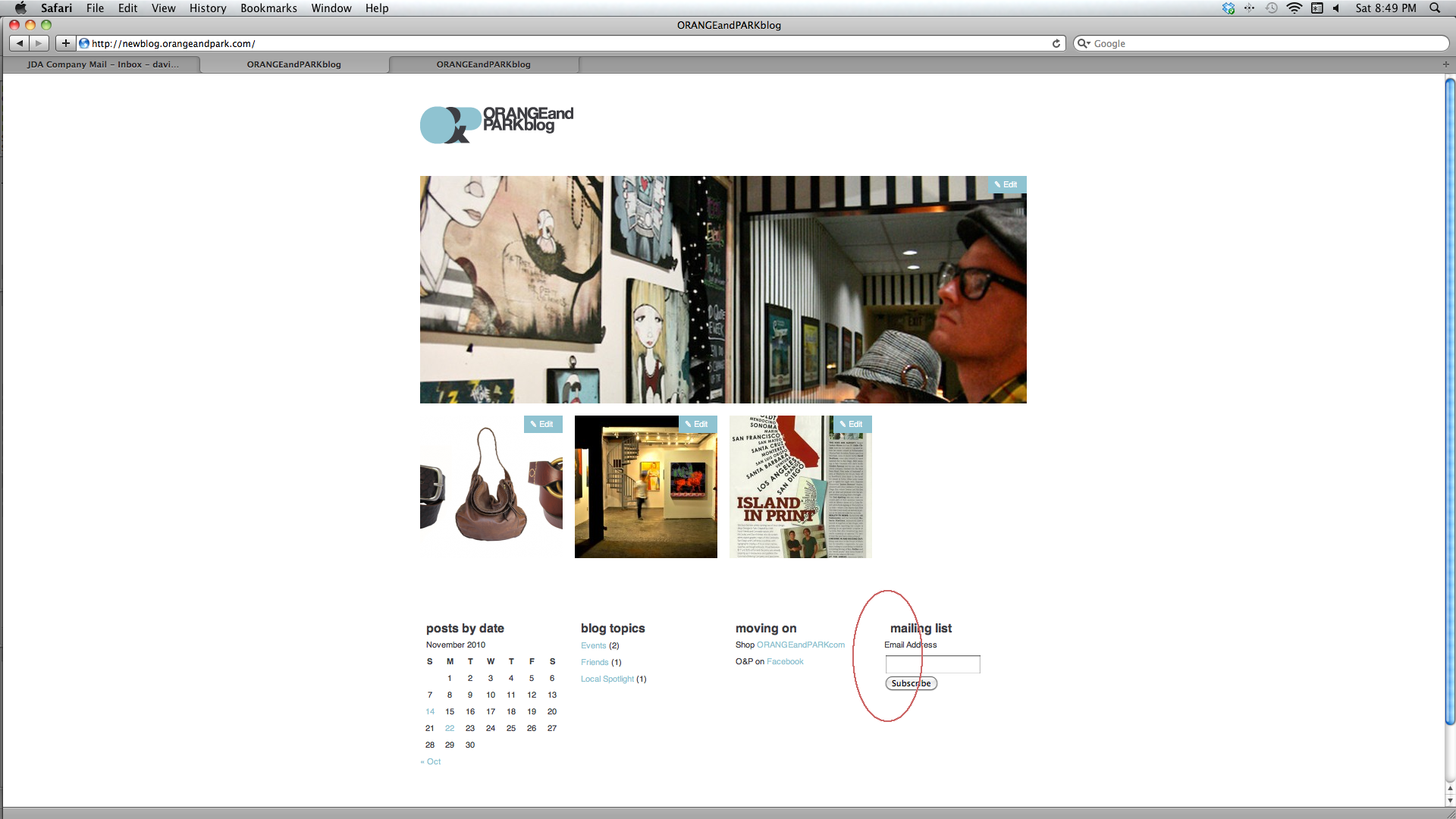
MailChimp alignment in Autofocus theme WordPress
- SOLVED
I am using the MailChimp plugin with the Autofocus+ Pro theme. Unfortunately, the form elements in the MailChimp widget do not align properly with the widget's title. The email address input field and Subscribe button should both be indented about 15px to the right, to left align with the title of the widget. Help!

Answers (1)
2010-11-28
Buzu B answers:
I can do this for $20.00 Please send me a message if you are interested.
Buzu B comments:
I saw your screenshot, and I could get the url from it. You would need to edit your style.css file.
autofocus/style.css
Just add the following:
#mc_signup .mc_form_inside{

     margin-left: 9px !important;

}
It does it for me.


