Jquery WordPress
- SOLVED
Hello, this is not entirely a wordpress question, but IT IS on my wordpress site, so I thought I would ask here first:
I am building a site where I have some jQuery movement to hide/show the sidebars, you can see here:
http://www.foxstonecarr.co.uk/
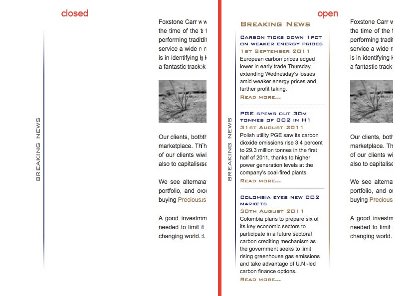
If you click the vertically aligned 'BREAKING NEWS' or 'FOXSTONE CARR ESSENTIALS' by the side of the sidebar columns, it hides the sidebar, but does not go entirely behind the button.
Is there anything I can do with CSS to get the sliding panel to go behind the button.
Attached is an image of what i'm after, and you can visit the site to see how it is at the moment.
I got so far with this, but stuck on this last little bit, hopefully someone can help me.
Thanks
Ross

Answers (5)
Fahad Murtaza answers:
OK
Here is the solution to the left button. I simply subtracted and added the width of the 'button' to the respective lines 15 and 24
  $(document).ready(function() {

  $('#slidebottom button').click(function() {

    $(this).next().slideToggle();

  });


  $('#slidewidth button').click(function() {

    $(this).next().animate({width: 'toggle'});

  });


  $('#slideleft button').click(function() {

    var $lefty = $(this).next();

    $lefty.animate({

      left: parseInt($lefty.css('left'),10) == 0 ?

      -$lefty.outerWidth()-19 :

      0

    });

  });


  $('#slidemarginleft button').click(function() {

    var $marginLefty = $(this).next();

    $marginLefty.animate({

      marginLeft: parseInt($marginLefty.css('marginLeft'),10) == 0 ?

      $marginLefty.outerWidth()+19 :

      0

    });

  });


  $('#slidewidthsome button').click(function() {

    var $some = $(this).next(),

    someWidth = $some.outerWidth(),

    parentWidth = $some.parent().width();

    $some.animate({

      width: someWidth === parentWidth ?

      someWidth/2 :

      parentWidth - (parseInt($some.css('paddingLeft'),10) + parseInt($some.css('paddingRight'),10))});

  });


});
Fahad Murtaza comments:
Got it http://www.foxstonecarr.co.uk/wp-content/themes/foxstone/js/javascript.js
Fahad Murtaza comments:
Also after fixing the animation, you will still need the Zindex to be fixed for both <button> (s) to be on top of the sliding layers.
Jurre Hanema suggested the right solution for z-index, make it high enough like 100.
Fahad Murtaza comments:
Also one more thing I noticed
The code below
.slide .inner {

background: url('images/sidebar.jpg') top right no-repeat;

position: absolute;

left: 0;

bottom: 0;

width: 180px;

height: 530px;

color: #333;

padding:0 0 0 10px;

margin:0 19px 0 0;

}


.slide1 .inner {

background: url('images/sidebar1.jpg') top left no-repeat;

position: absolute;

left: 0;

bottom: 0;

width: 180px;

height: 530px;

color: #333;

padding:0 0 0 10px;

margin:0 0 0 19px;

}
is used for putting <strong>sidebar.jpg</strong> and <strong>sidebar1.jpg </strong>into both <strong>.slide</strong> and <strong>.slide1 </strong> which is not correct as it also has the blue bar on left and right respectively.
On the sidebar.jpg i.e
http://www.foxstonecarr.co.uk/wp-content/themes/foxstone/images/sidebar.jpg
you have to remove the right blue bar and vice versa for sidebar1.jpg.
Then you can add these bars to the newstab.jpg (right side) and essentials.jpg (left side)
Then these blue bars will be part of the button images and not the sliding layers. Hope that helps :)
Jeff Rose answers:
I was going to say something similar. The Z-index needs to be adjusted on the button relative to the content.
Grégory Viguier answers:
It's not a css problem, your div.inner doesn't animate enough.
when you use outerWidth() in jQuery, if you want to include the margin (it's your case), use outerWidth(true).
That's all :)
(see at the jQuery website : http://api.jquery.com/outerWidth )
Answer to myself :
In second though, I missed one thing, your buttons have a background and can hide your div.inner. So, yes, you can do quite the same thing with css.
button {

    position: relative;

    z-index: 50;

}

.inner {

    z-index: 30;

}


