


Dynamik Website Builder fixed header and nav, mobile WordPress
- SOLVED
Clients are asking for sites with "sticky headers" and "sticky navs;" preferably sites in which the header and / or nav remains pervasive even when adapted to mobile view.
I need to know how to build them using Dynamik Website Builder for Genesis.
Ideally, I'd like to know how to use DWB to make the header and nav adapt responsively and remain pervasive while viewed in the smaller mobile responsive device sizes, such as these sites, which were built with Genesis, do:
http://www.vlvtest.com/simplicity/ and http://www.upwardcreative.com/
AND how to use DWB to create a site with a header and nav that remains fixed at larger sizes and then changes so that the header and / or nav are no longer pervasive, as the Genesis Pro child theme Agency Pro and Beautiful do.
Please understand I can't call this solved unless the answer tells me how to achieve this with Dynamik Website Builder for Genesis. (I've already spend days and days on tutorials for this project using Genesis - and I appreciate the people who created the tutorials. But I haven't found anything that addresses the mobile responsive part of pervasive headers and navs (at least, not at the low-tech level I can understand) or anything that addresses this for Dynamik Website Builder.
Thanks to many hours with tutorials from FatMedia, sridharkatakam.com, studiopress, Cobalt apps, and others.... I can create a sticky header or a sticky nav or both and the sites look good on desktop devices and tablets in landscape view, but nothing I've done works when the site is viewed on a smaller device.
DWB's responsive design options are terrific - but when I used CSS to set the site header to a fixed position with a high z-index, the mobile menu remained open. I haven't been able to figure out how to disable that CSS in the mobile query areas, which I thought would be a simple solution.
I do own all of the Genesis Pro themes and Genesis Extender. However, none of the Genesis child themes in the Pro Pack with pervasive site headers / nav (such as Agency Pro) remain pervasive in mobile view.
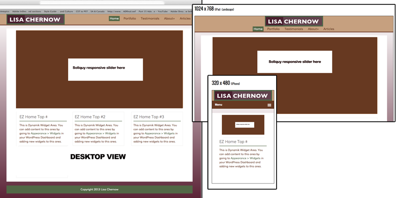
I have attached a screen shot that shows a site I'm building using DWB -- in full desktop view, ipad landscape view and iPhone vertical view.
Thanks in advance.
Answers (2)

zebra webdesigns answers:
Hello lchernow
Place the below code in the Theme settings footer area.
You can find it in the bottom of the page.
Change the menu class as you like and the number '50 depends on your menu height'. I have done this in two sites with dynamic and genesis. But I cant show them here due to NDA.
this also needs a little media Query trick.
I can assist you to do the things.
Let me know if you are interested.
<script>

jQuery(window).bind('scroll', function() {

         if (jQuery(window).scrollTop() > 50) {

             jQuery('.menu').addClass('fixed');

         }

         else {

             jQuery('.menu').removeClass('fixed');

         }

    });

</script>
zebra webdesigns comments:
Hello Ichernow
I have gone through your requirement again and I hope you have already gone though lot of steps to achieve what you are looking for.
Here I dont think you need Jquery scroll fix as I suggested.
If in case you need me.
Skype iD: bhuvan530531
email: [email protected]
zebra webdesigns comments:
Below is the jsfiddle version I created for example.
http://jsfiddle.net/hpLjP/
The only problem for you is mobile version.
I need to take a look at the website and debug the code in browser.
So that I can give a better solution.
You can either PM me or send a mail
Have a good day.

lchernow comments:
Zebra,
I am indeed interested if you know how to do this in Dynamik and Genesis. I understand Non Disclosure Agreements and wouldn't ask you to violate one.
However, while I do know where the media query settings are in Dynamik, I'm not sure what I would need to do so far as "the little media query trick" and what modifications I'd make or where I would make them if I used the script you provided. I would need more information to make this work.
zebra webdesigns comments:
Hello lchernow
Yes I know how to work in dynamik and genesis and all my recent projects are going on that.
I use the media query given by dynamik mostly to trigger the mobile menu.
apart from that I can code my media query in dynmik custom CSS manually to get more grip in the style.
At this point I just need to know your website URL to take a look.
Before we start the work. I can take a look either through teamviewer [if the website is not live]
or though skype screen sharing.
zebra webdesigns comments:
<blockquote>DWB's responsive design options are terrific - but when I used CSS to set the site header to a fixed position with a high z-index, the mobile menu remained open. I haven't been able to figure out how to disable that CSS in the mobile query areas, which I thought would be a simple solution.</blockquote>
My kind advice for mobile is better dont go for fixed menu.
Since the mobile screen is already small .It will occupy more space.
Instead use scroll to top plugins available and put in the site.
So that users can scroll to top easily.
If you still want the mobile menu to be fixed. Let me know we can sort it out.
lchernow comments:
Thank you, Zebra.
When I did get the header (with logo and navigation) to be fixed (using CSS), I could not figure out how to make the mobile version to be NOT fixed. It was both fixed and stuck in the open position. I have received a possible solution that I am going to try now and I shall post results shortly.
zebra webdesigns comments:
Hello Ichernow
Its better use the media query to control the position:fixed problem for mobile
use the code in the dynamic custom CSS
@media only screen and (min-width:100px) and (max-width:767px) {


.fixed .menu{

position:relative !important;

}
I am not sure about the ID or class you used. So gave a general class.
zebra webdesigns comments:
Oops lchernow The code is useful when you dont give the position:fixed via css and you want to make it sticky while scrolling.
Apart from that It works great :)
another one advantage you can add the css via javascript and style the sticky menu differently on scrolling.
Hope you understand now.
zebra webdesigns comments:
Hello lchernow
I have deactivated the sticky menu plugin and no javascript is used now.
Only the media query trick is used.
Please check and confirm.
Have a good day

Kyle answers:
Think I can help you out. I have used Dynamik quite a bit.
Would the effects used with the Minimum Pro theme meet your criteria?
Kyle comments:
You need to add this js to the script area in Dynamik
jQuery(function( $ ){

	$("header .genesis-nav-menu").addClass("responsive-menu").before('<div id="responsive-menu-icon"></div>');

	$("#responsive-menu-icon").click(function(){

		$("header .genesis-nav-menu").slideToggle();

	});

	$(window).resize(function(){

		if(window.innerWidth > 768) {

			$("header .genesis-nav-menu").removeAttr("style");

		}

	});

});
Then add this css to the style area:
#responsive-menu-icon {

    cursor: pointer;

    display: none;

    margin-top: 10px;

    margin-top: 1rem;

    margin-bottom: 10px;

    margin-bottom: 1rem;

}


#responsive-menu-icon::before {

    -webkit-font-smoothing: antialiased;

    color: #fff;

    content: "\e00e";

    font-family: 'Icon';

    font-size: 16px;

    font-size: 1.6rem;

    font-style: normal;

    font-variant: normal;

    font-weight: normal;

    line-height: 1;

    margin: 0 auto;

    speak: none;

    text-transform: none;

}


@media only screen and (max-width: 1023px) {


    .site-header .widget-area {

        text-align: center;

    }


}


@media only screen and (max-width: 768px) {


    .responsive-menu {

        display: none;

    }


    #responsive-menu-icon {

        display: block;

    }

}
This will add the collapsable button to the header menu on mobile devices. Let me know if this solves what you are looking for and if you need help implementing.
Kyle
lchernow comments:
Kyle, thank you! I didn't know how to get in touch with you directly, but I was hoping you would see this and respond, because I did see one of your posts here on WP questions in which you said you've used Dynamik Website Builder.
Yes, if I could unlock the secret of Minimum Pro in DWB, that would help so much, so long as I have the ability to use a graphic (a logo) in the header, rather than just text.
If you looked at my png, you know I am using a graphic in the header and I am using the header right widget nav on the site in the png. But, the client who most wants to have a fixed header and nav -- like, yesterday -- has a much larger graphic than the one in my png (not one I created) and he's NOT going to give it up! So, his site uses a logo image centered in the header, then the primary nav underneath it. You can see it here (but do not judge me for it). http://usainctx.com/
I would be so grateful if you can help me achive this!
lchernow comments:
Oy, Kyle, I will go try the code you posted right now - I responded after you posted the note but before you posted the code. Just afraid that my header and nav won't "stick"
Kyle comments:
Oh okay, now that I see the site I have a better idea of what you were describing. Give Zebra Webdesign's code below a shot, that looks like it may get the job done, but if that doesn't work we can add a jQuery plugin to handle it nicely.
Kyle comments:
This is what I've used in the past for the effect: [[LINK href="http://stickyjs.com/"]]http://stickyjs.com/[[/LINK]]
Kyle comments:
If you are still having trouble I wrote a quick plugin (attached) let me know if it works.
