Change width on blog post & widget WordPress
- SOLVED
Hi,
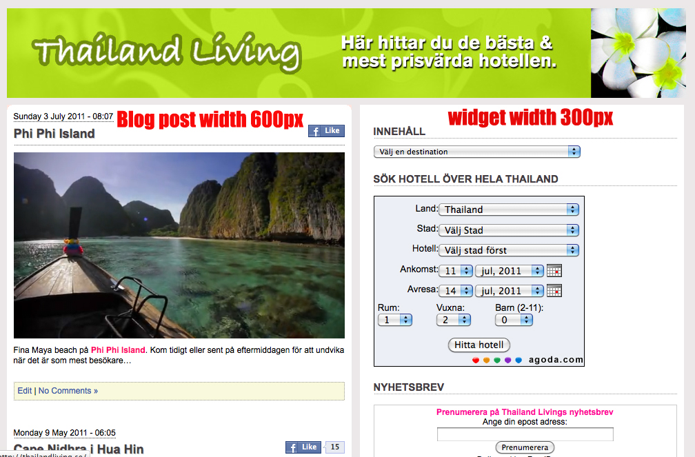
I want to make my blog post wider and the widget more narrow, see attached image
I want the blog post to be width 600px and the widget content to be maximum 300px
http://www.thailandliving.se
thanks
Charlotte

Answers (1)
Luke America answers:
Try the following. We can tweak it a little too.
1. open: /wp-content/themes/charlotteNew/style.css
2. put these two lines at the very end:
.post {width:600px;}
#sidebars {width:300px;}
3. in these files: index.php, single.php, category.php, etc, replace:
<div class="side" style="width:470px;border-bottom:8px solid #999;">
WITH
<div class="side" style="border-bottom:8px solid #999;">
Charlotte Raboff comments:
Hi,
I have added the code to the style.css and done the other changes as well but I can´t find any category.php file...
BUT it doesn´t look good, some of the background in the blog post is missing and the widget is to far right...
Luke America comments:
Not all themes have a category.php. In your case, index.php is most likely handling this functionality. Give me a couple of minutes to review the current output...
Charlotte Raboff comments:
Thanks Luke:)
Luke America comments:
Revise the CSS file at the end to the following:
.post {width:600px;}
#sidebars {width:300px;}
#blog {width:600px;}
If that's not precise, try #blog at 700px too.
There are some hard-coded styles that we may have to tweak as well.
Charlotte Raboff comments:
#blog at 625px looks fine but the widget is to far out on the right hand side...
Luke America comments:
Try the following:
REPLACE:
#sidebars {width:300px;}
WITH
#sidebars {width:300px; float:left;}
Charlotte Raboff comments:
No, it didn´t help much, I see only half of the widget...
Luke America comments:
That's because each of those items have their own fixed width. You'll either have to shorten their width (which will distort items like hotel form) ... or set the #sidebars with to a larger value, eg, 350px.
Also, in the CSS file, #sidebar1, #sidebar2, and #sidebar3, have a padding 10px for the entire block.
Add this at the bottom of the CSS file:
#sidebar1{padding-left:0px;}
#sidebar2{padding-left:0px;}
#sidebar3{padding-left:0px;}
#sidebar1 ul li{margin-left:2px; overflow:visible;}
#sidebar2 ul li{margin-left:2px; overflow:visible;}
#sidebar3 ul li{margin-left:2px; overflow:visible;}
Charlotte Raboff comments:
Luke, I added the last code and also change sidebar width to 350px but I can´t see any change really....
Luke America comments:
Your entire content is 982 pixels in width. (BTW, your header image is 985 pixels in width.)
If we set the post area to 600, that leaves 382 for the sidebar.
Try this (replacing the previous style):
#sidebars {width:360px; float:left; margin-left:-20px; overflow:visible;}
Charlotte Raboff comments:
I have updated with that code and the margin on the left hand side is bigger and it looks better in the widget BUT there is still a lot of space between the blog post and the widget...
Luke America comments:
There is most likely some hard-coded style affecting output. But, try this. Let's see what the output is:
#sidebars {width:400px; float:left; margin-left:-100px; overflow:visible;}
Charlotte Raboff comments:
#sidebars {width:400px; float:left; margin-left:-150px; overflow:visible;} - now the is in good position but still only half of the widget is visible...
Luke America comments:
Okay. That must be why the hard-coded style was in single.php previously. Try this:
in these files: index.php, single.php, replace:
<div class="side" style="border-bottom:8px solid #999;">
WITH
<div class="side" style="width:400px;border-bottom:8px solid #999;">
Tweak the "400px" to get the exact width you need.
We're almost there...
Charlotte Raboff comments:
Yes...almost:)
the widht is ok now but the widget is to close to the blog post
I change the "400px" but 400 seems best...
Luke America comments:
Okay, now try this:
#sidebars {width:400px; float:left; margin-left:-110px; overflow:visible;}
Tweak the margin-left value for precision. It was -150px.
Charlotte Raboff comments:
Finally :-) #sidebars {width:400px; float:left; margin-left:-45px; overflow:visible;} - did it!
thanks


