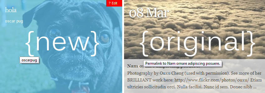
Autofocus+ : make mouseovers look like original version WordPress
- REFUNDED
I want to change the mouseover on main page to look like the original version of this theme.
orignal autofocus: [[LINK href="http://allancole.com/themes/"]][[/LINK]]
vs
new&improved autofocus+: [[LINK href="http://fthrwght.com/autofocus/"]][[/LINK]]
---
details
- this mod applies to regular/freebie version
- includes making dates larger (pls set font size of date to slightly a smaller 36px)
- and changing style of text to look like the orig
my site: http://bit.ly/biNNpE

Answers (2)
Darrin Boutote answers:
Did you include links? Nothing is showing for original vs. new and improved.
Darrin Boutote comments:
Change this line (#284) in your style.css style sheet from:
.blog #content .entry-meta abbr {font-size:24px;line-height:33px;letter-spacing:-1px;text-decoration:none;border:none;font-family: "Garamond", "Hoefler Text", Times New Roman, Times, serif;}
to:
.blog #content .entry-meta abbr {border:medium none;font-family:"Hoefler Text","Georgia",Georgia,serif,sans-serif;font-size:36px;letter-spacing:-1px;line-height:33px;text-decoration:none;}
Darrin Boutote comments:
Scratch that, this is the revised CSS:
Replace (line #284) in your style.css file from:
.blog #content .entry-meta abbr {

    font-size:24px;

    line-height:33px;

    letter-spacing:-1px;

    text-decoration:none;

    border:none;

    font-family: "Garamond", "Hoefler Text", Times New Roman, Times, serif;

    }
to:
.blog #content .entry-meta abbr {

    font-size:36px;

    line-height:36px;

    letter-spacing:-1px;

    text-decoration:none;

    border:none;

    font-family:"Hoefler Text","Georgia",Georgia,serif,sans-serif;

    }
amanda bradshaw comments:
Sorry - don't know why the links didn't appear. Here they are again:
orignal version: http://allancole.com/themes/
new version: http://fthrwght.com/autofocus/plusdemo/
Sorry if my explanation wasn't clear >>> the answers given so far only address the text -- but not the rest of the styling. I need it to be *just like* the original version -- including the mouseover.
By mouseover, I mean the semi-transparent overlay. It's blue with 100% coverage in the new version --- I'm looking for the partial coverage / semi-transparent- white of the original version.
thanks
Darrin Boutote comments:
Amanda, I looked at the new version of the theme and the entire markup changed on the home page. Meaning, the new version isn't going to function 100% like the old with completely re-working it.
This is a post from the original version:
<div id="post-300" class="featured hentry p1 post publish author-ouxu-cheng category-photography tag- y2009 m03 d24 h06">
<div class="entry-date bigdate"><abbr class="published" title="2009-03-24T00:50:23-0600">24 Mar</abbr></div>
<h2 class="entry-title post-content-title"><a href="http://allancole.com/themes/300/photography-by-ouxu-cheng/" title="Permalink to Photography by Ouxu Cheng" rel="bookmark"><span>Photography by Ouxu Cheng</span></a></h2>
<div class="entry-content post-content">
<h4>Photography by Ouxu Cheng</h4>
<p>Photography by Ouxu Cheng (used with permission). See more of her BRILLIANT work here: http://www.flickr.com/photos/ouxu/Etiam cursus, ante et ullamcorper viverra, massa nulla lacinia diam, sit …</p>
</div>
<span class="attach-post-image" style="height:300px;display:block;background:url('http://allancole.com/themes/wp-content/uploads/2009/03/455838286_be21016cb8_b-800x543.jpg') center center repeat"> </span>
</div><!-- .post -->
And this is from the new version:
<div id="post-56" class="hentry p1 post publish author-frolic-photography category-uncategorized untagged comments-open pings-open y2010 m06 d25 h13 slug-wooof">
<h2 class="entry-title"><a href="http://frolicphoto.com/dailyfrolic/?p=56" title="Permalink to wooof." rel="bookmark">wooof.</a></h2>
<div class="entry-meta">
<span class="entry-date"><a href="http://frolicphoto.com/dailyfrolic/?p=56" class="published" title="2010-06-25T13:44:44-0700" rel="bookmark"><abbr class="published" title="2010-06-25T13:44:44-0700">25 Jun</abbr></a></span>
</div>
<a href="http://frolicphoto.com/dailyfrolic/?p=56" rel="bookmark" class="post-image-container"><img width="800" height="300" src="http://frolicphoto.com/dailyfrolic/wp-content/uploads/2010/06/bulldog_gracie2-800x300.jpg" class="attachment-aflarge" alt="bulldog_gracie" title="bulldog_gracie" /></a>
<div class="entry-content">
<p>Lorem ipsum dolor sit amet, consectetur adipisicing elit, sed do eiusmod tempor incididunt ut labore et dolore magna aliqua. Ut enim ad minim veniam, quis …</p>
</div>
<div class="entry-utility"></div><!-- .entry-utility -->
</div><!-- .post -->
The markup, and its corresponding CSS, has been completely redone in the newer version. The best way to have it be like the original--in terms of hovering--is to go back to the original (if you can).
amanda bradshaw comments:
Thanks - unfortunately the styling on the main page is the best part of the original version. The rest of it was kind of a mess. Guess I'll have to be happy with function over form/style :(
Buzu B answers:
I can do it for you. I'll send you a Message with my email address so you can contact me directly in case you want me to solve this for you.
Thanks.


